Creating custom popover component with Vue 3 and Tailwind CSS
In this article we'll see how we can create a custom design sytem popover component with vue 3 and tailwind css.
In this article, we'll see how we can create a custom design sytem popover component with vue 3 and tailwind css.
We can start by creating a new vue project.
npm create vue@latest
✔ Project name: … <your-project-name>
✔ Add TypeScript? … No / Yes
✔ Add JSX Support? … No / Yes
✔ Add Vue Router for Single Page Application development? … No / Yes
✔ Add Pinia for state management? … No / Yes
✔ Add Vitest for Unit testing? … No / Yes
✔ Add an End-to-End Testing Solution? … No / Cypress / Nightwatch / Playwright
✔ Add ESLint for code quality? … No / Yes
✔ Add Prettier for code formatting? … No / Yes
✔ Add Vue DevTools 7 extension for debugging? (experimental) … No / Yes

Scaffolding project in ./<your-project-name>...
Done.
After that, we can install Tailwind CSS in the project. We can do this by following this Link.
Lastly, we need to install vueuse library by following this command. We'll shortly see why it is required.
npm install @vueuse/core @vueuse/components
Now, we can start by creating a popover component.
<script setup>
import { ref } from 'vue';

const isOpen = ref(false);

const togglePopover = () => {
  isOpen.value = !isOpen.value;
};

const closePopover = () => {
  isOpen.value = false;
};
</script>

<template>
  <div class="relative inline-block" @click="togglePopover">
    <div class="cursor-pointer">
      <slot name="trigger"></slot>
    </div>
    <div
      v-if="isOpen"
      class="absolute z-10 min-w-[150px] p-2 bg-white border border-gray-200 rounded-lg shadow-lg"
      @click.self="closePopover"
    >
      <slot></slot>
    </div>
  </div>
</template>
Then, we can use this component in our app.vue
<script setup>
import AppPopover from './components/popover.vue';
</script>

<template>
  <div class="grid place-items-center h-screen w-screen bg-gray-100">
    <div class="rounded-lg bg-gray-200 w-1/2 h-1/2 place-items-center grid">
      <app-popover>
        <template #trigger> Trigger </template>
        <div>Popover Content</div>
      </app-popover>
    </div>
  </div>
</template>
Now, let's see the output,

Here, you can see when we launch the app, we see the trigger text and when we click on it, the popover menu opens. Currently, it closes we we click on the trigger again or somewhere in the content.
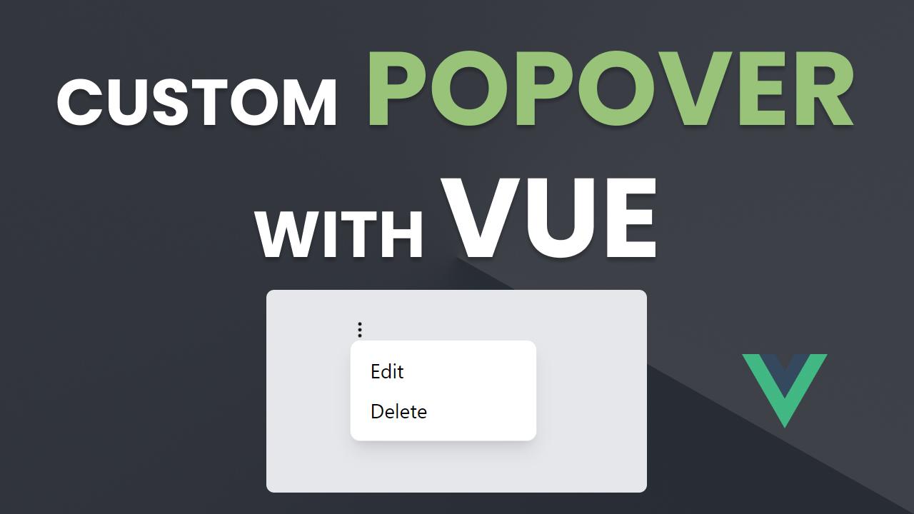
Now we can try updating the trigger text with a icon and then we can populate the popver content with the list as follows.
<script setup>
import AppPopover from './components/popover.vue';

const items = [
  {
    id: 1,
    label: 'Edit',
  },
  {
    id: 2,
    label: 'Delete',
  },
];
</script>

<template>
  <div class="grid place-items-center h-screen w-screen bg-gray-100">
    <div class="rounded-lg bg-gray-200 w-1/2 h-1/2 place-items-center grid">
      <app-popover>
        <template #trigger>
          <img
            src="https://img.icons8.com/material-rounded/24/menu-2.png"
            class="w-4 h-4 cursor-pointer"
          />
        </template>
        <div
          v-for="item in items"
          :key="item.id"
          class="hover:bg-gray-100 p-1 cursor-pointer"
        >
          <span class="pl-1">
            {{ item.label }}
          </span>
        </div>
      </app-popover>
    </div>
  </div>
</template>
Now, let's see the output again.

This mostly looks good now. But, there's one major issue. Which is, when we click outside the popover menu it should close. For this we can make use of vueuse library v-on-click-outside directive. We can update popover.vue as follows.
<script setup>
...
import { vOnClickOutside } from '@vueuse/components';
...
</script>

<template>
  <div v-on-click-outside="closePopover" ...>...</div>
</template>
If we take a look at the output again. We can see, now the popover menu successfully closes when we click anywhere outside it.

So, this is how we can create custom popover component. Let me know if you run into any issues ✌️.