Rendering Bhatkhande Notation Without a Font
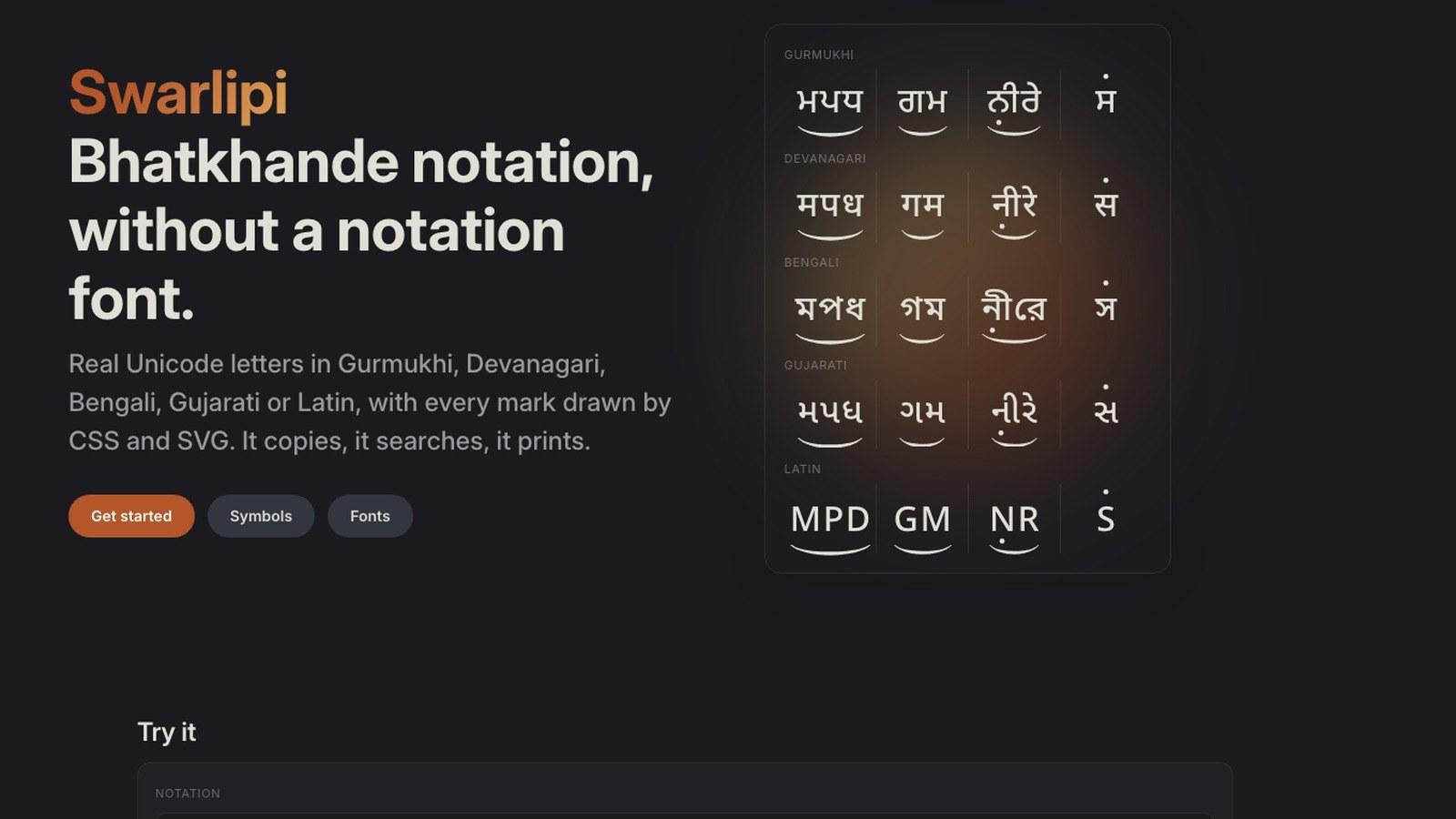
Bhatkhande notation has always needed a custom font on the web, which means the text is not really text. Swarlipi takes an ASCII grammar and renders real Unicode letters in five scripts, with every mark drawn in CSS and inline SVG.
I have shelves of Bhatkhande notation books. It is how Hindustani classical and most Sikh devotional music is written — Carnatic music uses a different system entirely — there are thousands of published books in it, and none of it is machine readable.
If you want it on a web page, you have exactly one established option: install a custom font and type into it.
That option has a cost nobody talks about. The text on your page is not really text.
What a Notation Font Actually Does
The Bhatkhande fonts in common use — the Omenad family is the standard — work by glyph substitution. You type s, you get ਸ. You type R, you get a komal re. You type u, you get an octave dot in the right place.
It looks correct. But the character in the document is still s.
Select that notation and copy it, and your clipboard has sr{g}m. Search the page for the note and you find nothing. A screen reader reads out Latin letters. Paste it anywhere without the font and it is gibberish. Index it and your search engine stores nonsense.
You do not have notation. You have a Latin string wearing a costume.
Why Nobody Had Fixed It
Because Bhatkhande is not a character set you can just adopt into Unicode.
The swaras are fine — they are ordinary letters in Gurmukhi, Devanagari, Bengali, Gujarati or Latin, all of which Unicode covers. The problem is everything around them:
- Octave dots above or below the letter, with different positions for mandra and taar
- Kan swars — grace notes, printed small and raised beside the main note
- Meend — a glide, drawn as a bar spanning two or more notes, and it can cross a beat boundary
- Ghaseet, a bracket with legs hanging below the bar
- Chhand markers above the beat
- Bols and beat dividers holding the line together
Half of these are not marks on a letter. They are relationships between letters. A font is a glyph substitution engine — it cannot stretch an arc across three characters and a space.
So everyone reached for a font and lived with it. The font does the dots, and the arcs get faked or dropped.
The Approach: ASCII In, Unicode Out
You keep typing ASCII. You stop rendering ASCII.
The input stays the plain-ASCII grammar people already type — s r g m, capitals for komal and tivra, u and l for octaves, {} for kan. That part is unchanged, and deliberately so.
What changes is the output. Instead of a font swapping each ASCII character for a picture of a letter, the renderer converts the ASCII to real Unicode letters — ਸ, स, স, સ, S — and draws every mark around them with CSS and inline SVG.
ASCII is a good input format. Musicians type it fast, it diffs cleanly, it fits in a database column. It is a terrible output format, and fonts let it stay one.
import { renderSwarlipi, swarlipiWrapperClass } from 'swarlipi';
import 'swarlipi/style.css';

const html = renderSwarlipi('@sr{g}m', 'gurmukhi');
element.className = swarlipiWrapperClass('gurmukhi');
element.innerHTML = html;
ਸ is a real ਸ. Copy it and you get ਸ. Search finds it. A screen reader says it. The octave dots, the kan bracket and the chhand marker are border and SVG ink positioned around it.
swarlipi is on npm and open-source with zero runtime dependencies — the docs site has the full API and script list. It returns an HTML string, so it is framework-agnostic and SSR-safe. Everything sizes in em, marks use currentColor so they inherit, and because they are real ink rather than backgrounds they print — no "enable background graphics" checkbox.
Five scripts: Gurmukhi, Devanagari, Bengali, Gujarati and Latin.
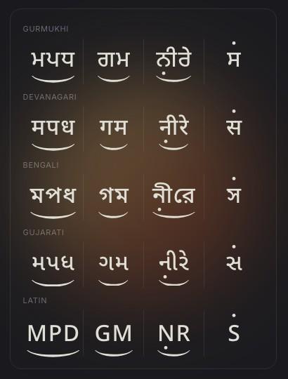
A script id names a letterform set, not a language — Marathi, Nepali, Konkani and Hindi notation are all devanagari.
The Input Grammar Isn't Mine
This is the decision I'd defend hardest, and it is not a technical one.
The input grammar is the Omenad keymap, character for character. Lowercase for the swaras, capitals for komal and tivra, u l U L for octaves, { } for kan, @#$%^&* for chhand, q w W e and Q E for meend and ghaseet, ; ' [ ] \ for bols.
So notation somebody typed twenty years ago, for a font, renders in Swarlipi unchanged. Nothing to convert, no migration, no tool to run. Two decades of existing material just works.
A better grammar was available. It would have been worthless.
The Part That Was Actually Hard
Not the dots. The vertical band.
Every marker in the Omenad faces shares one vertical band, and that band's bottom edge is exactly the top of the taar dot. That is why hand-set Bhatkhande looks even — a meend with a tick and a meend without one sit at the same height, because the tick hangs inside the band instead of pushing the bar up.
Reproducing that meant not letting anyone set the meend's top directly. It is derived, from the script's dot line minus the tick's total reach minus a pixel of clearance:
--sl-mbr-top = --sl-dot-a-top − (--sl-tick-top + --sl-tick-gap + --sl-tick-h) − 1px
Override the dot line if you must; the bar follows. Every meend then lands at one height per script, ticked or not.
There is a related trap I walked into. The bar's stroke weight is a fraction of the mark-zone height, and that fraction lives in two places — a CSS custom property the stylesheet reads, and a constant the layout code uses to compute bridges. I wrote a test that fails if they drift. They had already drifted once.
Cross-beat meend is the other hard one. A glide can start on one beat and end on the next, so the bar has to span two separately-positioned zones. The renderer emits mark zones and a small browser-only module bridges consecutive zones with an absolutely positioned bar, anchor-pinned where the engine supports CSS anchor positioning. That's the one piece that cannot be server-rendered, so it's quarantined in its own entry point and nothing else drags the DOM in.
Plain Text, and the Combining-Mark Bug
The renderer covers the web. It does not help when someone copies notation into Word.
So there's a plain-text export using Unicode combining characters:
toUnicodeNotation('Rl', 'devanagari'); // "रे̱̣"
The subtlety is where the marks go. The obvious placement — right after the consonant — is wrong. It has to come after the whole letter cluster, vowel sign included, because a combining mark between a consonant and its matra splits the syllable in CoreText and in Word. You get two broken pieces instead of one letter with a mark under it.
That's an hour of your life you can have back.
And Then, Fonts After All
Combining marks only show up where the destination font can shape them. So the package ships fonts too — which sounds like a defeat and is actually a clean split.
They're Noto Sans per script plus the six combining marks with GPOS anchors, one variable font each, weight 400–700. Renamed, because "Noto" is an OFL Reserved Font Name and you cannot ship a modified Noto under it.
A font still cannot stretch a chhand arc or a meend bar across letters. The renderer keeps that job. The font handles everything else — Word, Pages, PDFs, wherever the copied text lands.
Two things I did not expect to need.
Each script font also carries Noto Sans's basic Latin. Partly so a heading can share the face with the sargam, but mostly because Pages, Keynote and Numbers only list fonts that cover the system language. On an English-language Mac, a font with no Latin coverage does not appear in the font menu at all. It's installed, it works, and you cannot find it.
And for Latin-only notation there is no Swarlipi font, because plain Noto Sans already has all six marks with anchors — it is where the script fonts borrow theirs. Worth knowing: San Francisco and Times do not have the tivra mark (U+030D), so tivra in a system font silently falls back to another face.
Ship .woff2 for @font-face and .ttf for installing. Nothing installs a WOFF2.
Open-Sourcing One Package from a Private Monorepo
You want one package public and the rest of the monorepo private, without copy-paste drift and without giving up the monorepo. git subtree split does it, the monorepo stays the source of truth, and the whole thing fits in a script with four guards.
Running Coding Agents in Disposable Docker Containers
An agent that can edit files and run shell commands needs a blast radius. One container per task, a hard budget cap, and a control server inside each container so you can talk to a running agent — built on the Claude Agent SDK.